
Last updated August 1, 2026
Good text heights make a drawing legible. Too small and nobody can read it. Too large and the information will not fit. A drawing is easier to read when the same height is used for the same kind of information throughout: every dimension and note one size, every section title another, every sheet title another again.
In CAD you draw everything at 1:1. A plate 250 mm long is drawn 250 mm long. But the drawing is printed at a scale, and while the scale does not change the linework it changes everything about the text. The whole problem comes down to one line:
paper height × scale factor = model text height
At 1:100, text you want to read 2.5 mm high on paper has to be drawn 250 mm high in the model. At 1:10 it is 25 mm. Get it wrong and the drawing looks like the left-hand panel below.
Metric text height at every scale
Find your scale down the left, read across to the height you want on paper, and that is the height to give the text in your model. The 2.5 mm column is the one you will use most: it is the standard height for dimensions and notes.
| Drawing scale | 2.5 mm on paper | 3.5 mm on paper | 5 mm on paper | 7 mm on paper |
|---|---|---|---|---|
| 1:1 | 2.5 | 3.5 | 5 | 7 |
| 1:2 | 5 | 7 | 10 | 14 |
| 1:5 | 12.5 | 17.5 | 25 | 35 |
| 1:10 | 25 | 35 | 50 | 70 |
| 1:20 | 50 | 70 | 100 | 140 |
| 1:25 | 62.5 | 87.5 | 125 | 175 |
| 1:50 | 125 | 175 | 250 | 350 |
| 1:100 | 250 | 350 | 500 | 700 |
| 1:200 | 500 | 700 | 1000 | 1400 |
| 1:500 | 1250 | 1750 | 2500 | 3500 |
| 1:1000 | 2500 | 3500 | 5000 | 7000 |
| 1:1250 | 3125 | 4375 | 6250 | 8750 |
| 1:2500 | 6250 | 8750 | 12500 | 17500 |
Which height for which job
The ISO 3098 lettering heights step by roughly 1.4 — the square root of two. That is not a coincidence. The standard says the progression is taken straight from the paper sizes: the same √2 that makes two A4 sheets into an A3. So when a drawing is reduced from A1 to A3, the text that was 5 mm lands on the next size down the list rather than on some awkward number in between.
| Height | Line width, type B (h÷10) | Line width, type A (h÷14) | What it is for |
|---|---|---|---|
| 1.8 mm | 0.18 mm · red | 0.13 mm · violet | Only when the standard height will not fit. Does not survive a reduction or a scanned print, so use it sparingly. |
| 2.5 mm | 0.25 mm · white | 0.18 mm · red | The general-purpose height: dimensions, notes, labels, callouts. Most of the text on a drawing is this size. |
| 3.5 mm | 0.35 mm · yellow | 0.25 mm · white | Secondary titles – SECTION A-A, DETAIL 3 – and the headings inside schedules and tables. |
| 5 mm | 0.5 mm · brown | 0.35 mm · yellow | Primary titles: TYPICAL FLY BRACE DETAIL. The name of the thing you are looking at. |
| 7 mm | 0.7 mm · blue | 0.5 mm · brown | Big titles. Rare in the drawing space itself, but standard on cover sheets and in the title block. |
| 10 mm | 1.0 mm · orange | 0.7 mm · blue | Cover sheet and drawing register titles. |
The pen colour code is the text height code
Type B line width is the height divided by ten, and that is why the old pen sets and the lettering stencils carried the same colours. A 3.5 mm stencil was used with the 0.35 pen, and the 0.35 pen was yellow, so the stencil was yellow. The colours survive in every line width table in the office, and they still tell you which pen belongs to which text.
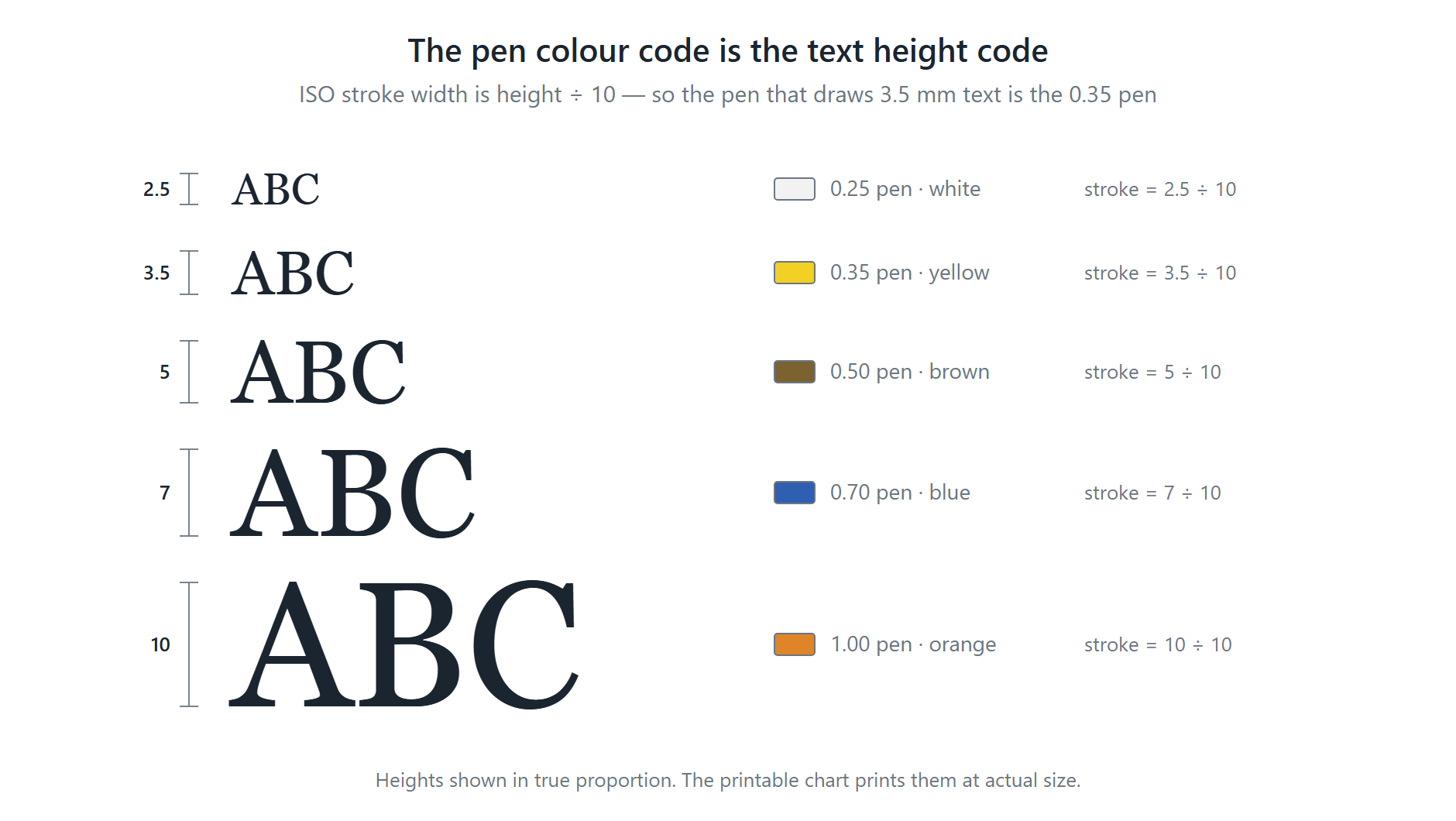
A note on the pen widths in the table above. This page previously paired 2.5 mm text with a 0.35 pen, 3.5 mm with 0.5, and so on — one step heavier than the standard at every height. ISO 3098-0:1997 gives only two line widths for a given height: h÷10 for type B and h÷14 for type A. The table now shows both. Plenty of offices do plot text a step heavier than ISO on purpose, because a 0.25 line on 2.5 mm characters does not survive a reduction to A3 or a photocopy, and that is a reasonable house rule — but it is a house rule, not the standard.
Imperial text height at every scale
The rule does not change, only the arithmetic. An imperial scale is written as the length that represents one foot, so the scale factor is 12 divided by that length. At 1/4” = 1′-0” a foot is drawn a quarter of an inch long, so the factor is 12 ÷ 0.25 = 48, and 1/8” text on paper is drawn 6” high in the model.
Architectural scales
| Drawing scale | 3/32″ on paper | 1/8″ on paper | 3/16″ on paper | 1/4″ on paper |
|---|---|---|---|---|
| 3″ = 1′-0″ | 3/8″ | 1/2″ | 3/4″ | 1″ |
| 1 1/2″ = 1′-0″ | 3/4″ | 1″ | 1 1/2″ | 2″ |
| 1″ = 1′-0″ | 1 1/8″ | 1 1/2″ | 2 1/4″ | 3″ |
| 3/4″ = 1′-0″ | 1 1/2″ | 2″ | 3″ | 4″ |
| 1/2″ = 1′-0″ | 2 1/4″ | 3″ | 4 1/2″ | 6″ |
| 3/8″ = 1′-0″ | 3″ | 4″ | 6″ | 8″ |
| 1/4″ = 1′-0″ | 4 1/2″ | 6″ | 9″ | 1′ |
| 3/16″ = 1′-0″ | 6″ | 8″ | 1′ | 1′-4″ |
| 1/8″ = 1′-0″ | 9″ | 1′ | 1′-6″ | 2′ |
| 3/32″ = 1′-0″ | 1′ | 1′-4″ | 2′ | 2′-8″ |
| 1/16″ = 1′-0″ | 1′-6″ | 2′ | 3′ | 4′ |
| 1/32″ = 1′-0″ | 3′ | 4′ | 6′ | 8′ |
Civil and engineering scales
| Drawing scale | 3/32″ on paper | 1/8″ on paper | 3/16″ on paper | 1/4″ on paper |
|---|---|---|---|---|
| 1″ = 10′ | 11 1/4″ | 1′-3″ | 1′-10 1/2″ | 2′-6″ |
| 1″ = 20′ | 1′-10 1/2″ | 2′-6″ | 3′-9″ | 5′ |
| 1″ = 30′ | 2′-9 3/4″ | 3′-9″ | 5′-7 1/2″ | 7′-6″ |
| 1″ = 40′ | 3′-9″ | 5′ | 7′-6″ | 10′ |
| 1″ = 50′ | 4′-8 1/4″ | 6′-3″ | 9′-4 1/2″ | 12′-6″ |
| 1″ = 60′ | 5′-7 1/2″ | 7′-6″ | 11′-3″ | 15′ |
| 1″ = 100′ | 9′-4 1/2″ | 12′-6″ | 18′-9″ | 25′ |
| 1″ = 200′ | 18′-9″ | 25′ | 37′-6″ | 50′ |
Printable chart
Download the text height at scale chart (PDF) — two A4 sheets, metric on the first and imperial on the second, with the ISO heights and pen widths and a worked example. Print the one your office works in and pin it up.
There is a matching printable sheet sizes chart for the paper the drawing goes on.
Getting it right in CAD
- Annotative text does the multiplication for you. Set the paper height once in the text style, mark the style annotative, then give each viewport its scale. AutoCAD works out the model height. The tables above are what it is calculating.
- You still need the tables when text is not annotative — older drawings, drawings from other offices, blocks with hard-coded attribute heights, and anything drawn straight into paper space.
- One drawing, one scale, wherever you can. Details at a different scale on the same sheet need their own text height, and that is where mixed heights creep in unnoticed.
- Check the plot, not the screen. Text that looks fine zoomed in can be unreadable at size. Print one sheet at 100% before you issue a set.
- Line weight matters as much as height. Too heavy a pen closes up the counters in a, e and 8 at small sizes. This is only a concern for stroke fonts such as ISOCP, where you set the width; TrueType fonts like Arial carry their own weight.
Sample application
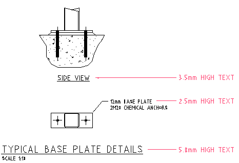
Subscribe to our YouTube channel.
References
- ISO 3098-0:1997, Technical product documentation — Lettering — Part 0: General requirements. Table 1 (type A, d = h÷14) and table 2 (type B, d = h÷10); clause 5.1 defines nominal size on upper-case letters and clause 5.3 gives the √2 range of heights. iso.org
- ISO 9175-1:1988, Tubular pens for drawing — Part 1: Definitions, dimensions, designation and marking, for the line width series and its colour code. iso.org
- ISO 216:2007, Writing paper and certain classes of printed matter — Trimmed sizes — A and B series, the source of the √2 progression ISO 3098 uses for lettering heights. iso.org
- ISO 128-20:1996, Technical drawings — General principles of presentation — Part 20: Basic conventions for lines, referenced by ISO 3098-0 clause 5.3 for line widths. iso.org
- Pen sizes and line types (metric) — the full ISO line type table and the pen colour for each width.
- Common metric structural scales — which scale to use for which drawing.
- Paper sizes chart: ANSI, ARCH and ISO A — the sheet the text is going on, with a printable PDF.